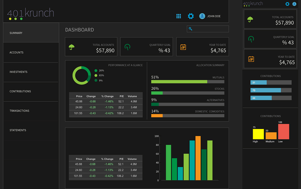
Kivalia UI and Identity Concept

Background
Kivalia is a small startup building a 401(k) management platform. Five different potential user types are served on the platform. The problem Kivalia faced was gaining accounts from investors that were not already served in their database. I proposed a solution that responded to all the users by creating a set of modals that effortlessly guides the user through making choices towards building their 401(k) plan.
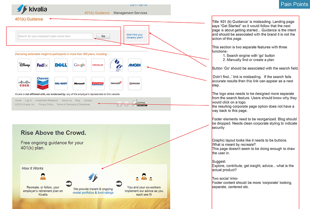
Identifying Pain Points on the Landing Page
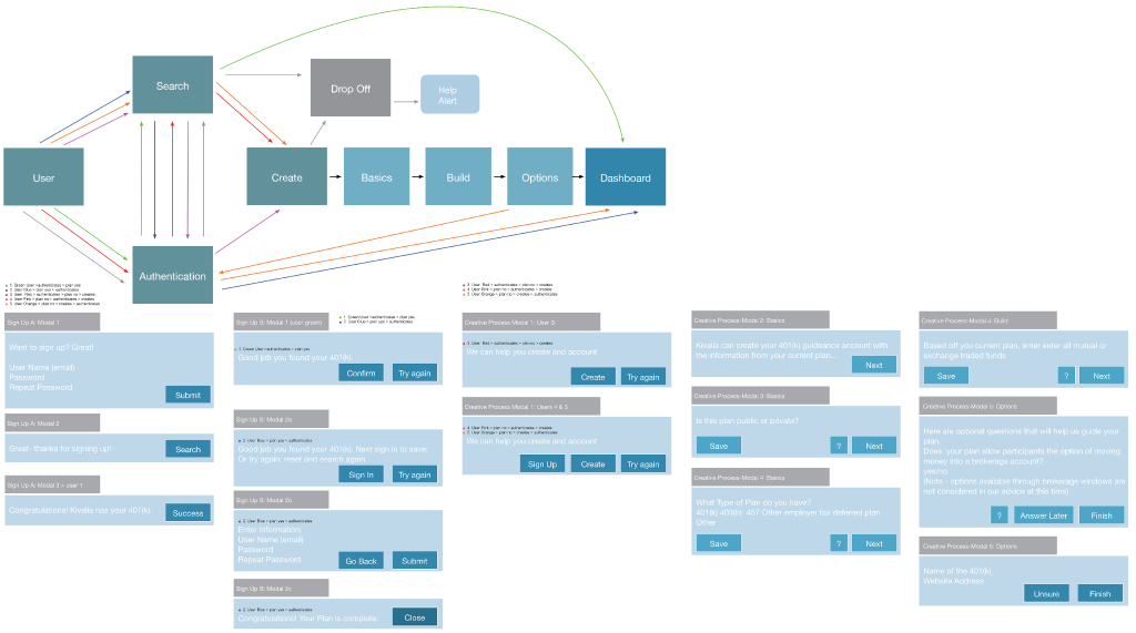
Site Flow / Modal Interactivity Mapping
This diagram maps the shortest, simplest paths to guide users through the sign up process for the program. Modals can be tested to determine best responses to the paths.
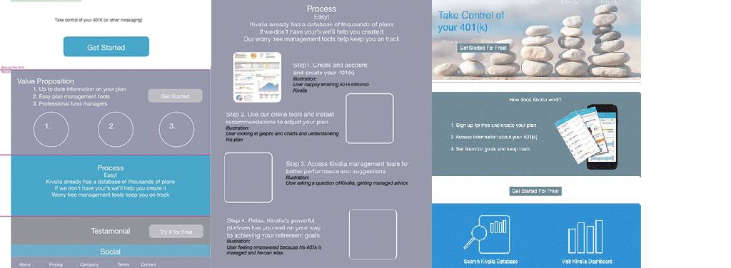
Landing Page Redesigns
Wireframes solve content hierarchy for new features on the landing page.
Style Explorations
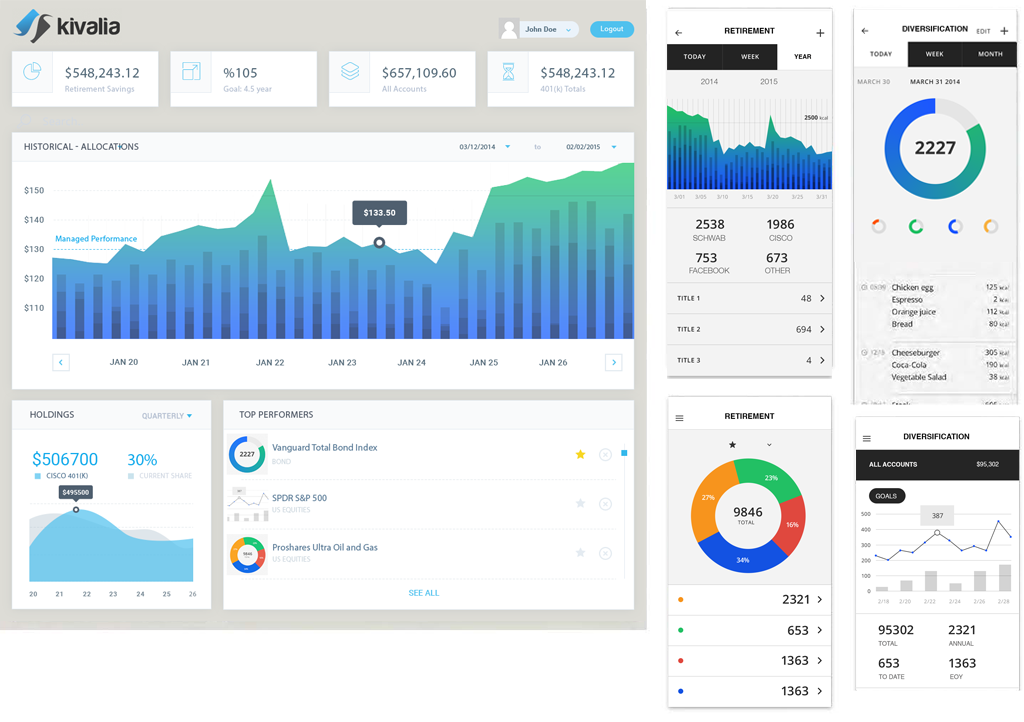
Two different style approaches were presented. Dashboard A styling with it’s predominantly white and blue color scheme, evokes a predictable look and feel for a young financial technology start up. Dashboard B pushes boundaries in the financial industry but may be more appealing to Kivalia’s demographic. The dark colors lend well to creating a pallet that more easily delineates data from administrative content.
Colors and Type

Dashboard B
